corporate identity
Earth Week
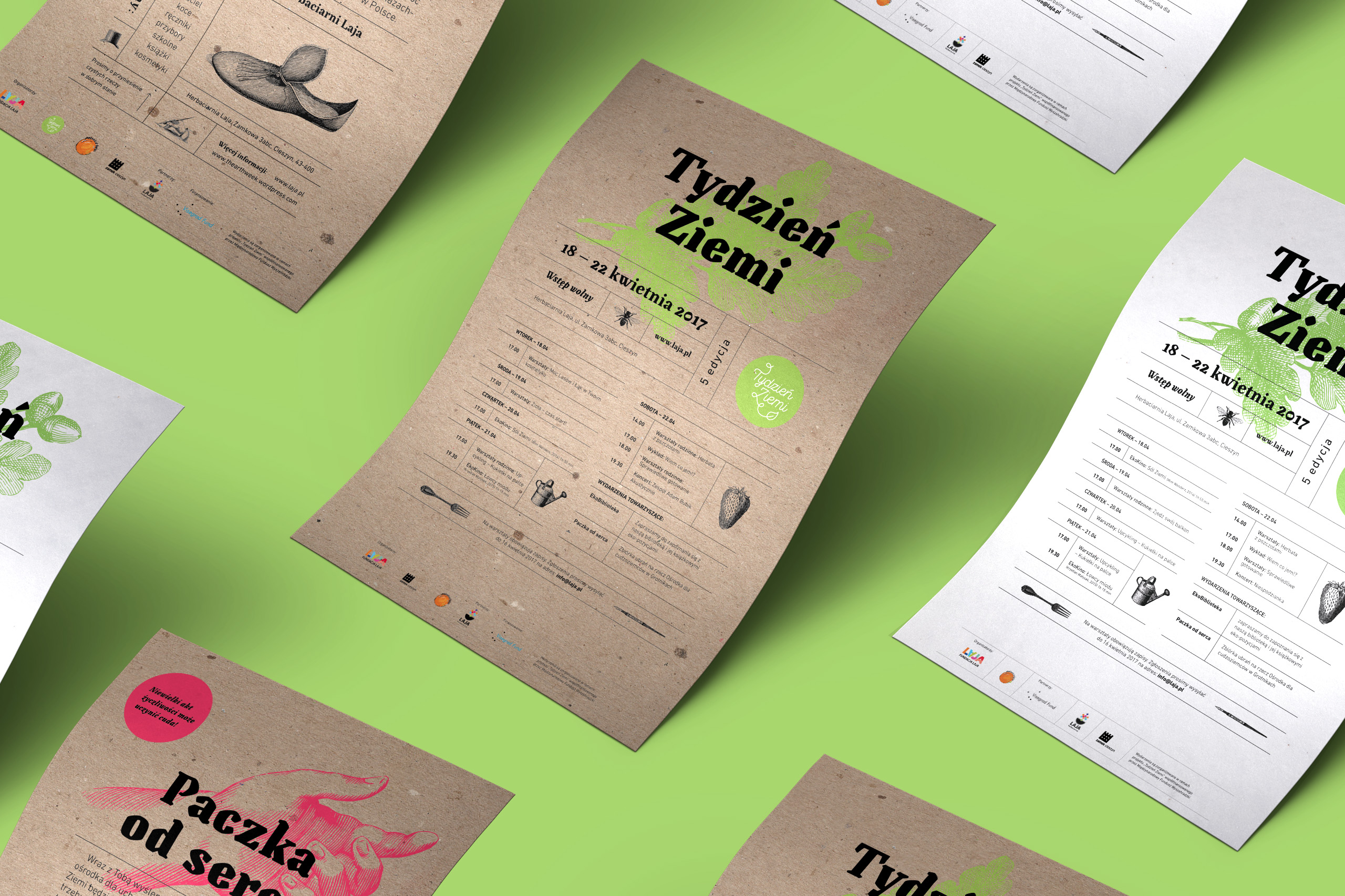
The Earth Week is a festival and a grassroot initiative related to the Earth Day celebrated worldwide. This educational event is organized out of care for the natural environment and people’s health. The festival, existing for several years, was growing in scale, and yet it still had no coherent visual identity. That’s why I was asked to design the visuals for the festival, so that it could become a more recognizable brand outside its niche milieu.
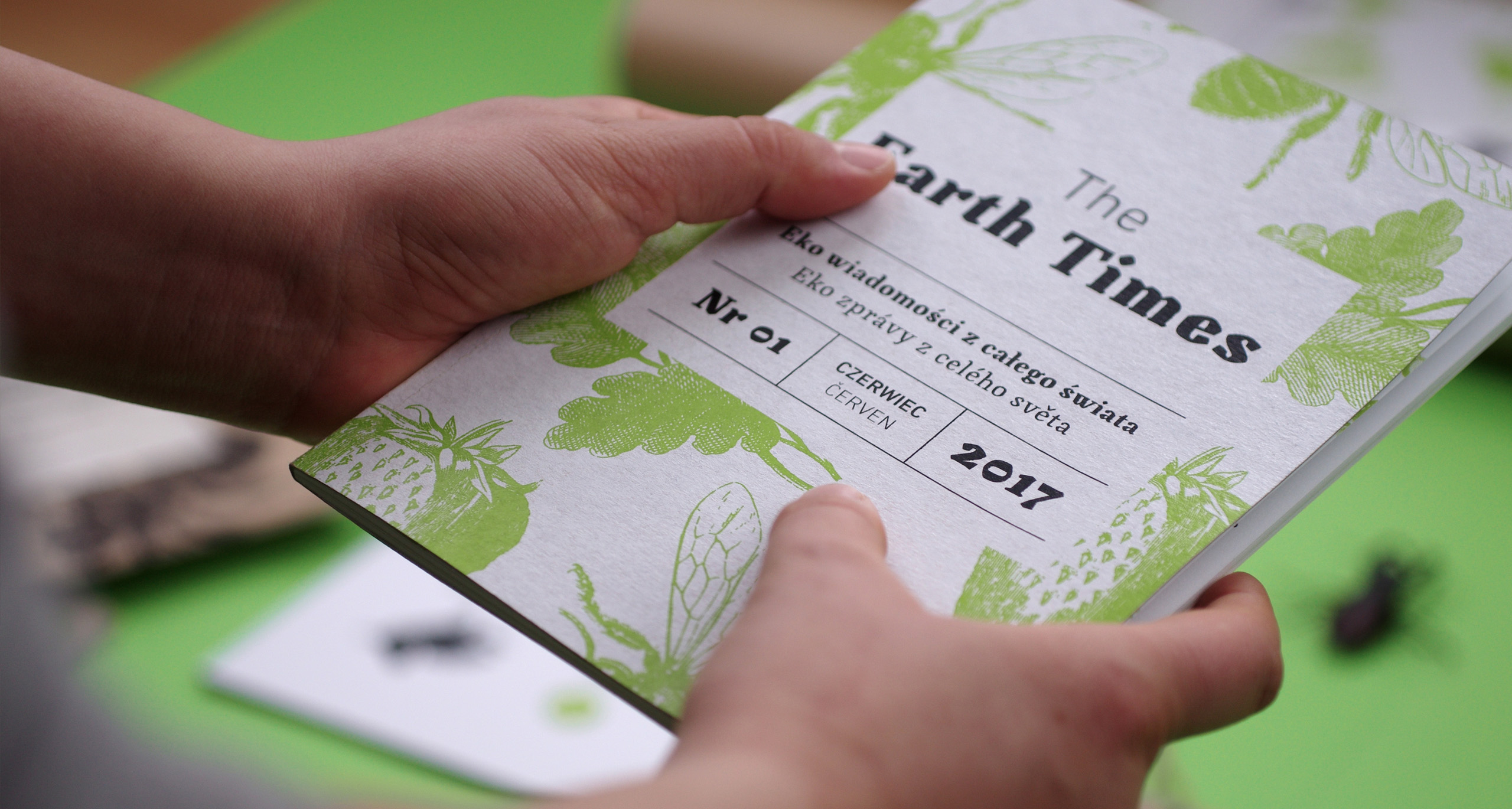
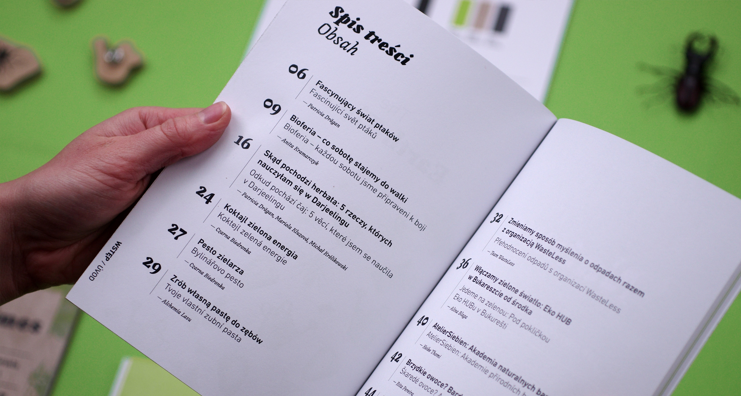
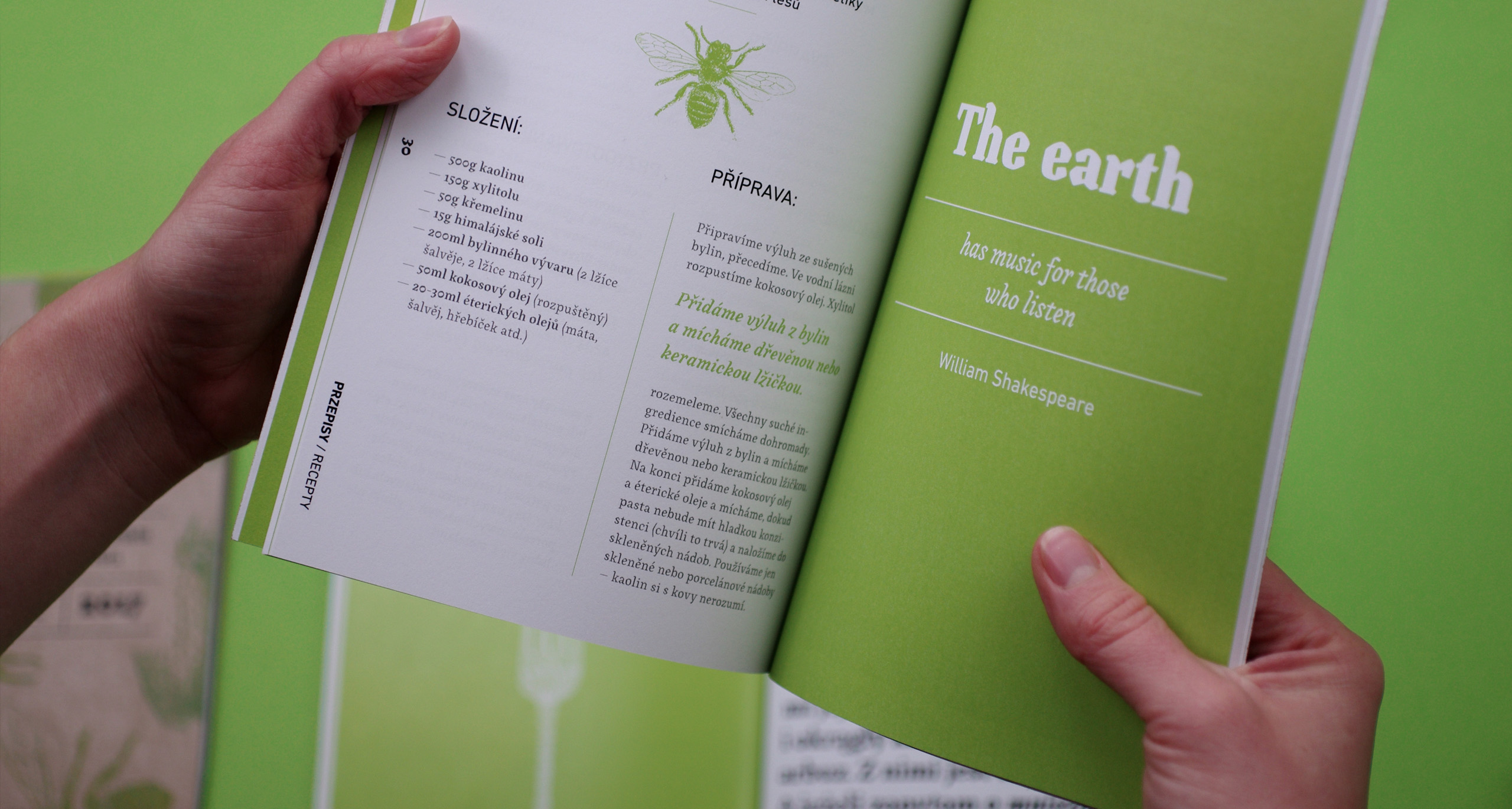
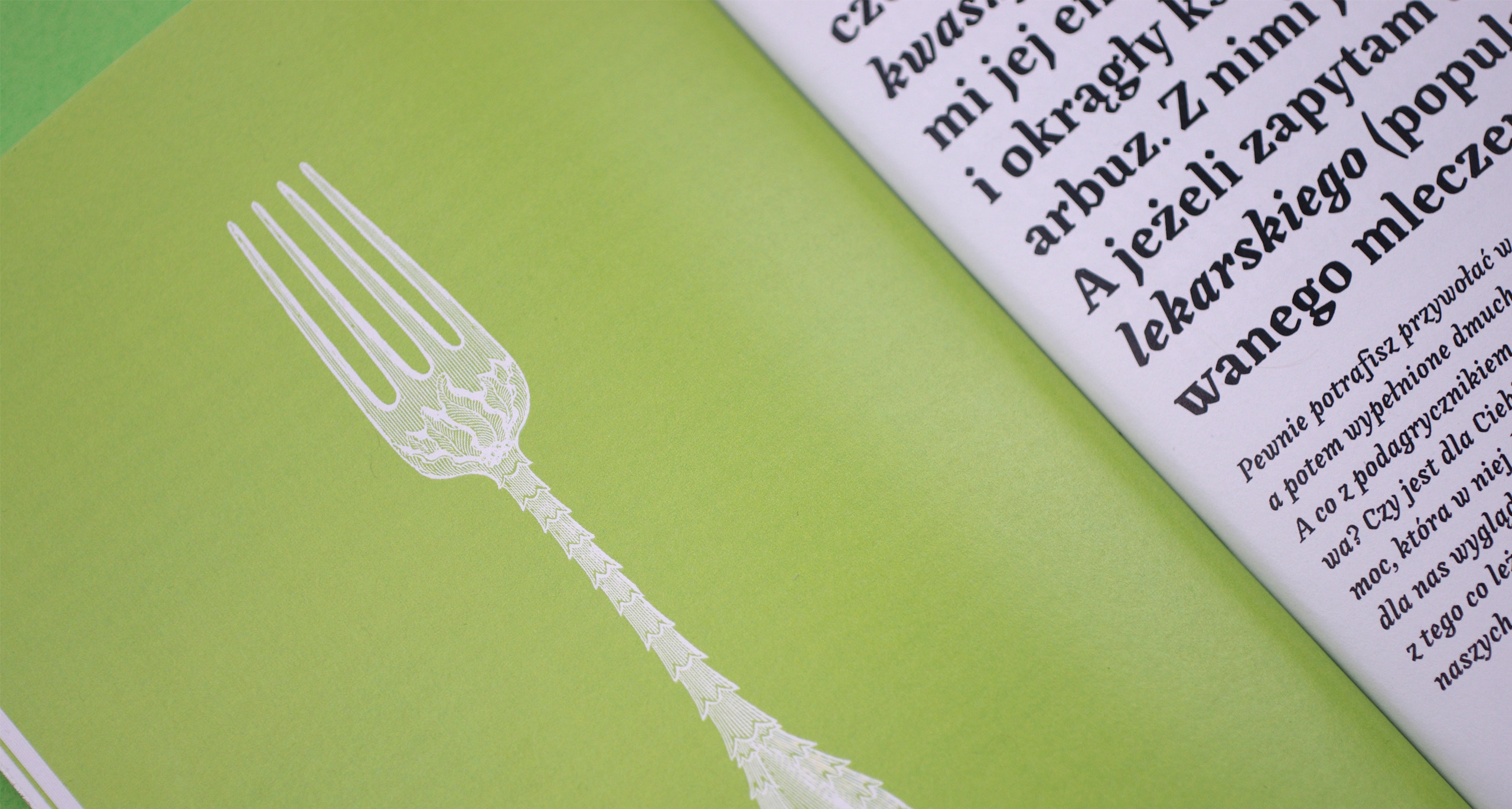
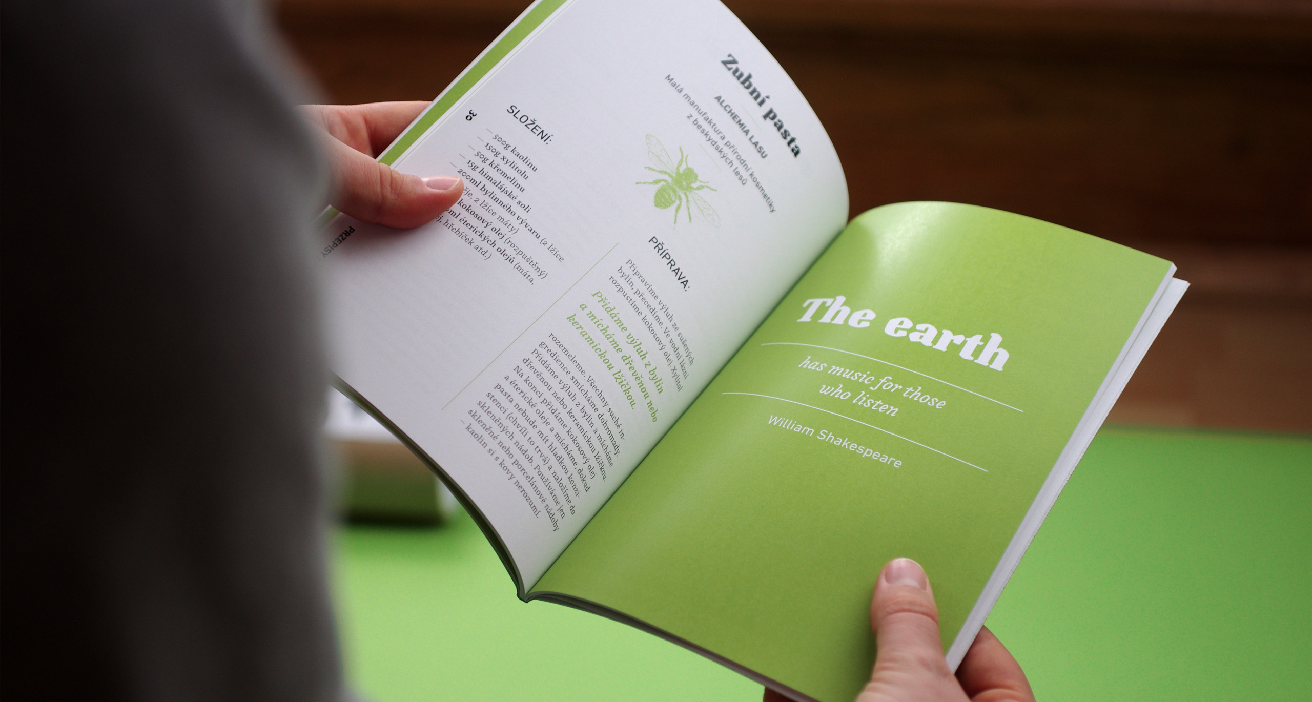
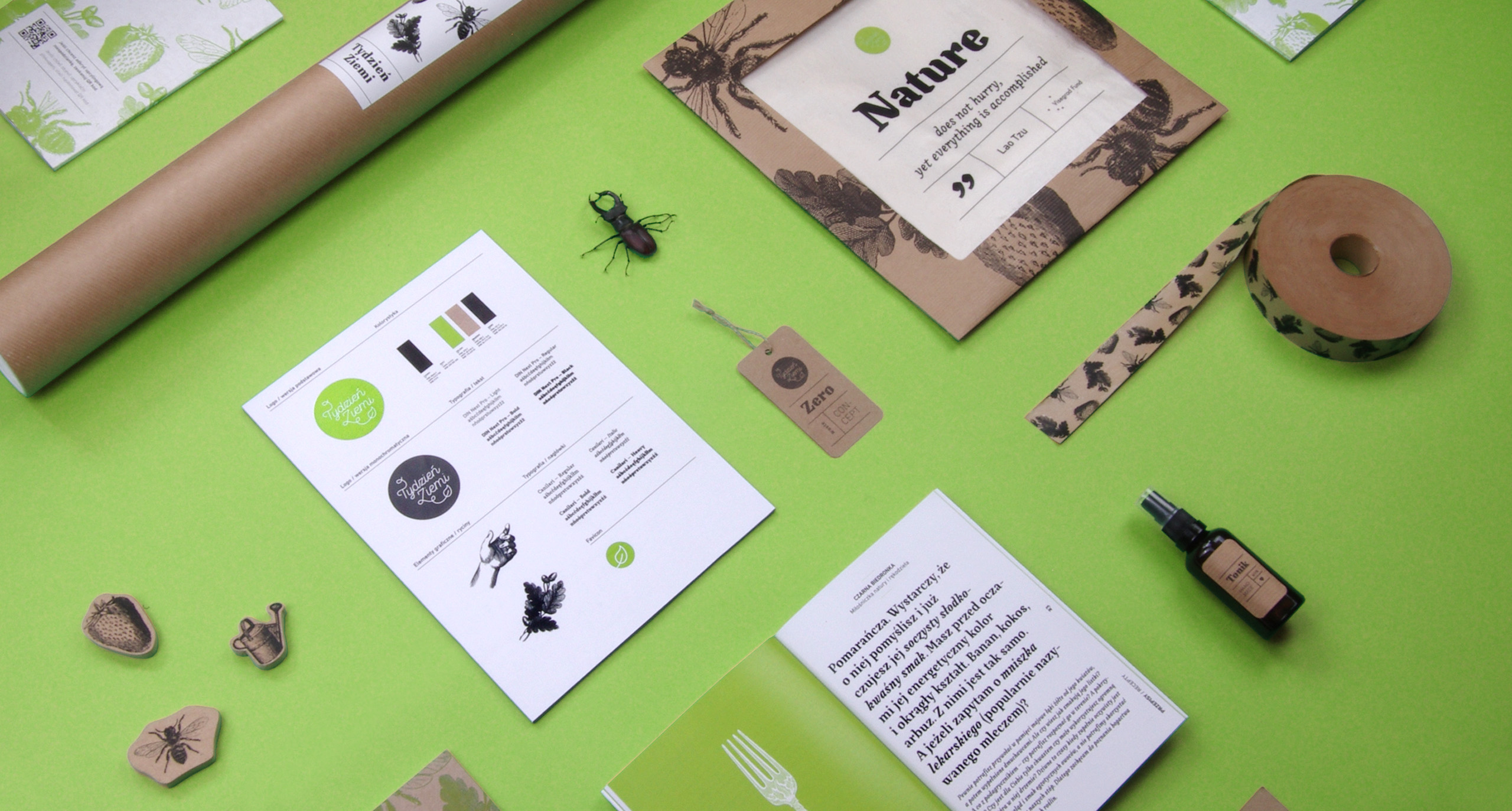
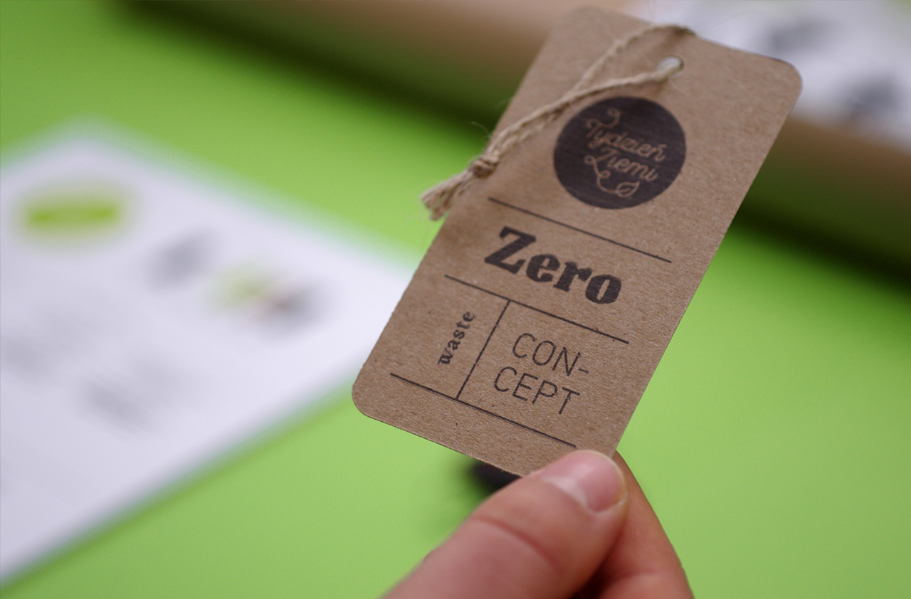
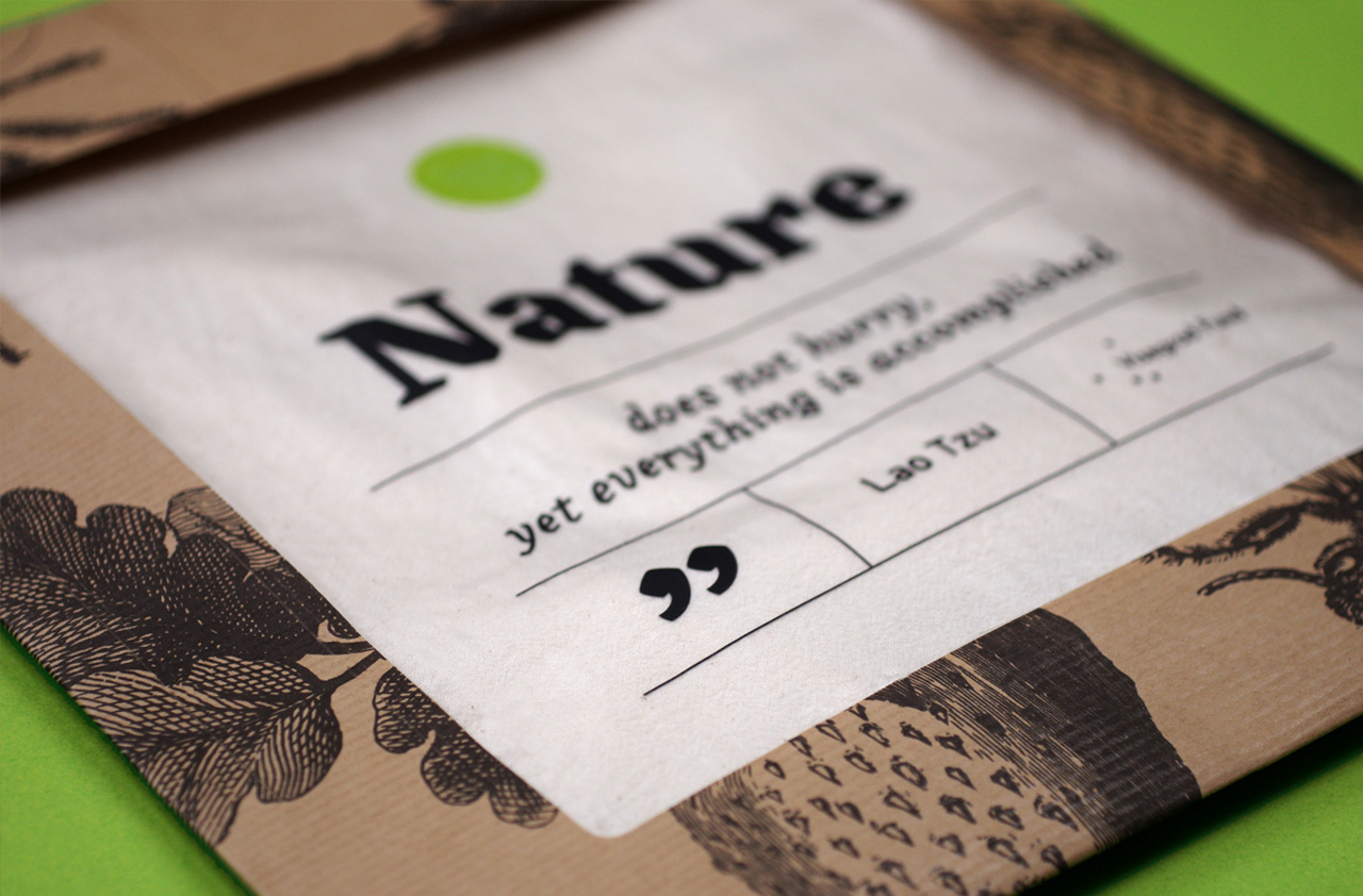
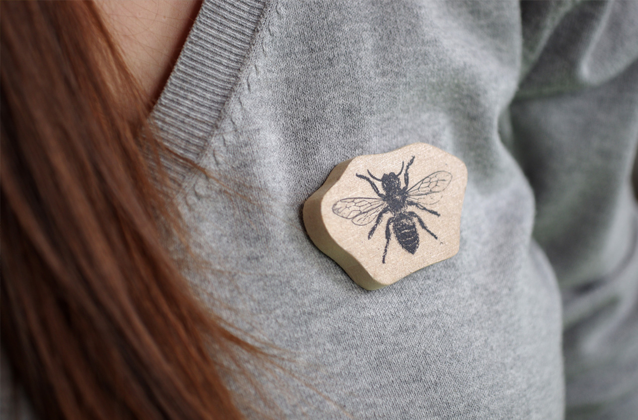
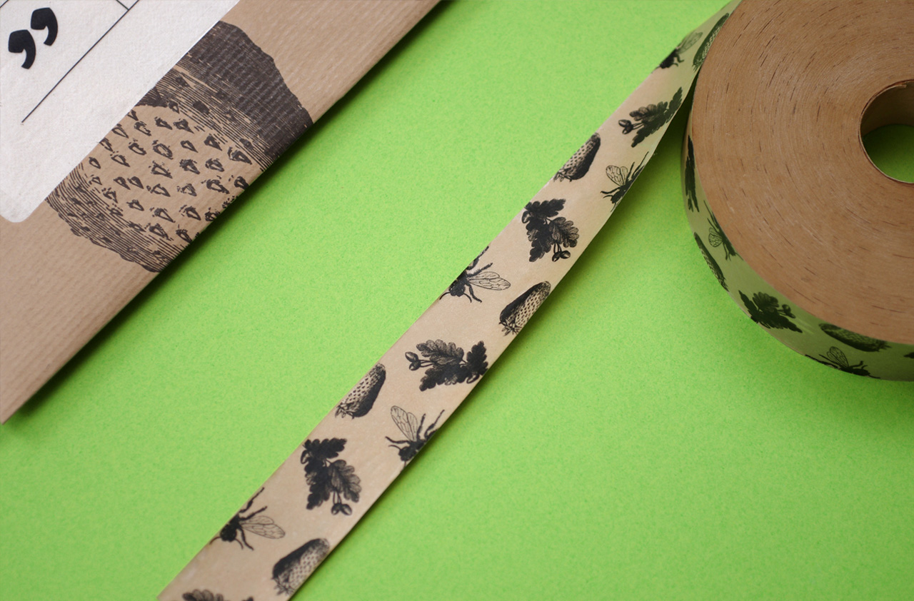
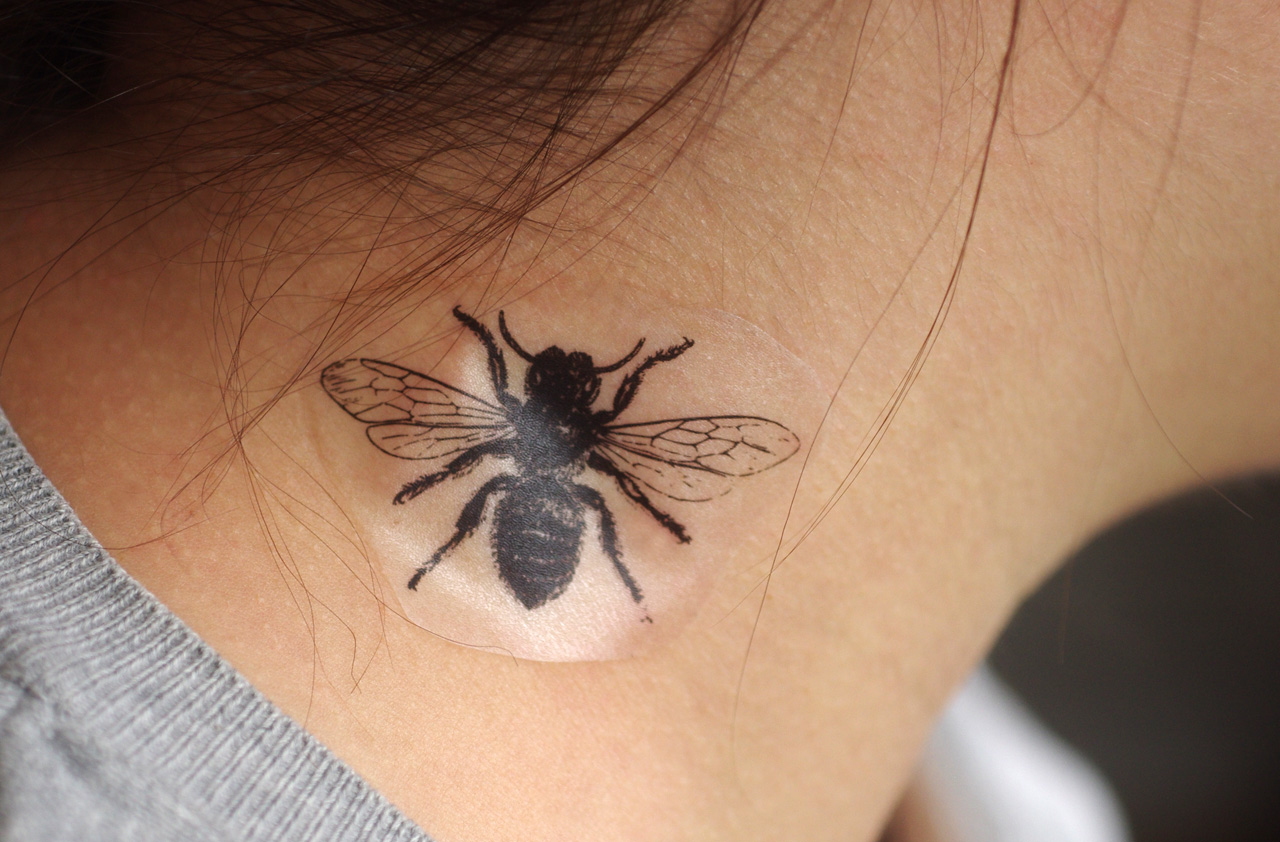
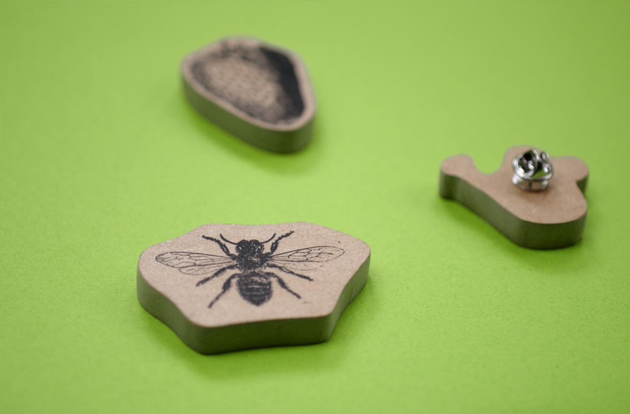
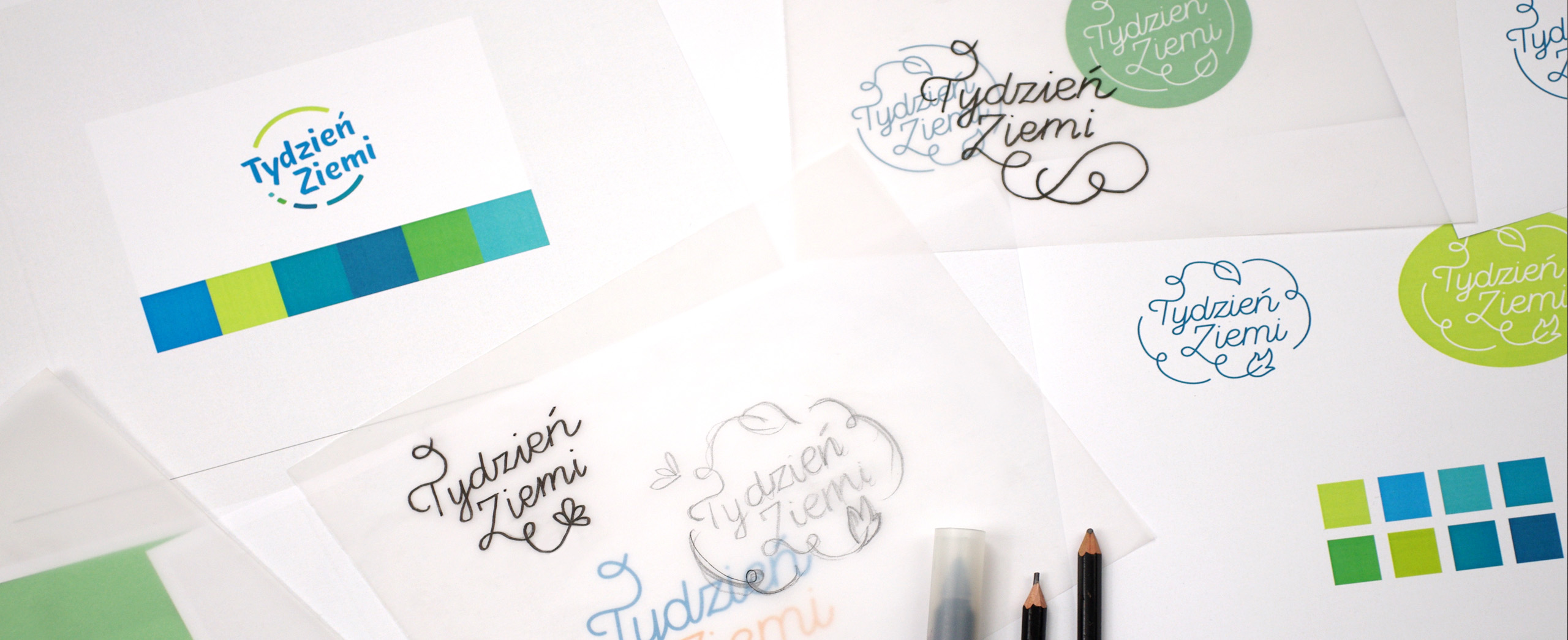
I created the visual identity: the logo, based on educational and ecological values, the colors, spring-like and fresh; and graphics, illustrations based on the vast collection of the Rijksmuseum in Amsterdam. The advertising materials were printed in a local printing house, on recycled brown paper using ecological printing ink. An important element promoting the ideas behind the festival was the publication titled The Earth Times. It was distributed free of charge in libraries and cafés, so it reached a large number of young people, inspiring them to start living a simple and sustainable life. Apart from the logo, publication, social media campaign, and posters, I also designed a fun and attractive starter kit: recycled bags, paper tape, labels for handmade cosmetics, and wooden pins. The project as a whole is an inspiration for anyone to move towards change and ecological development in small steps and through local actions.