UX Design
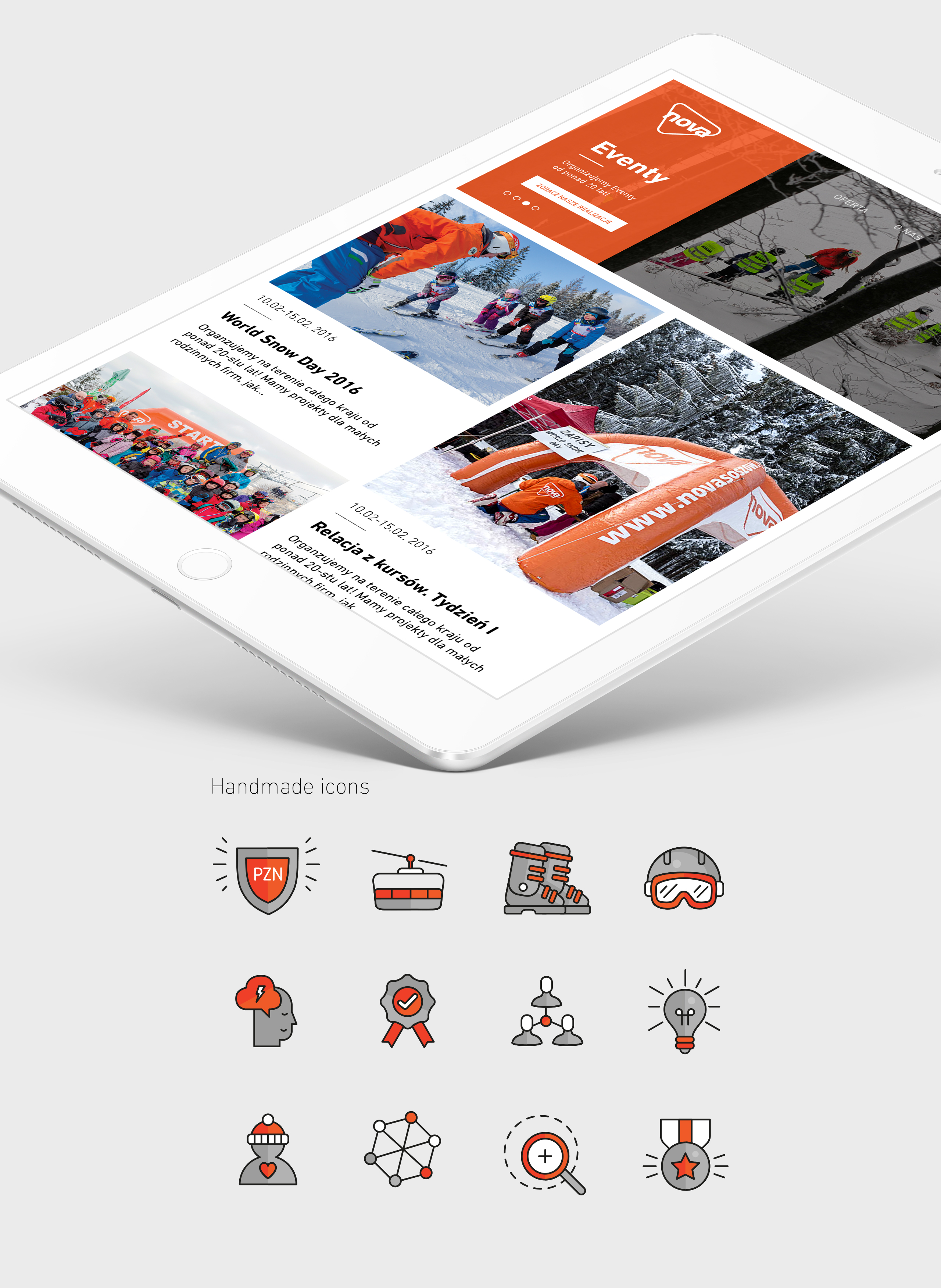
Ski School
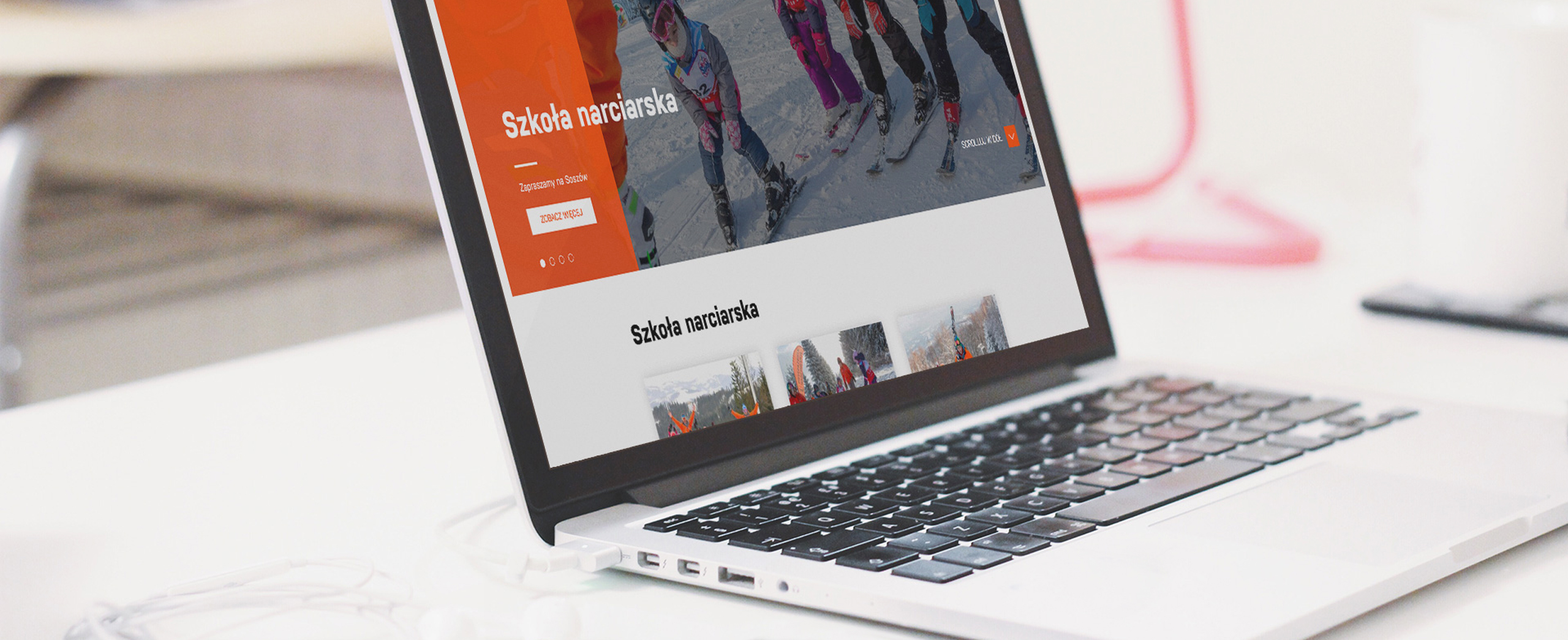
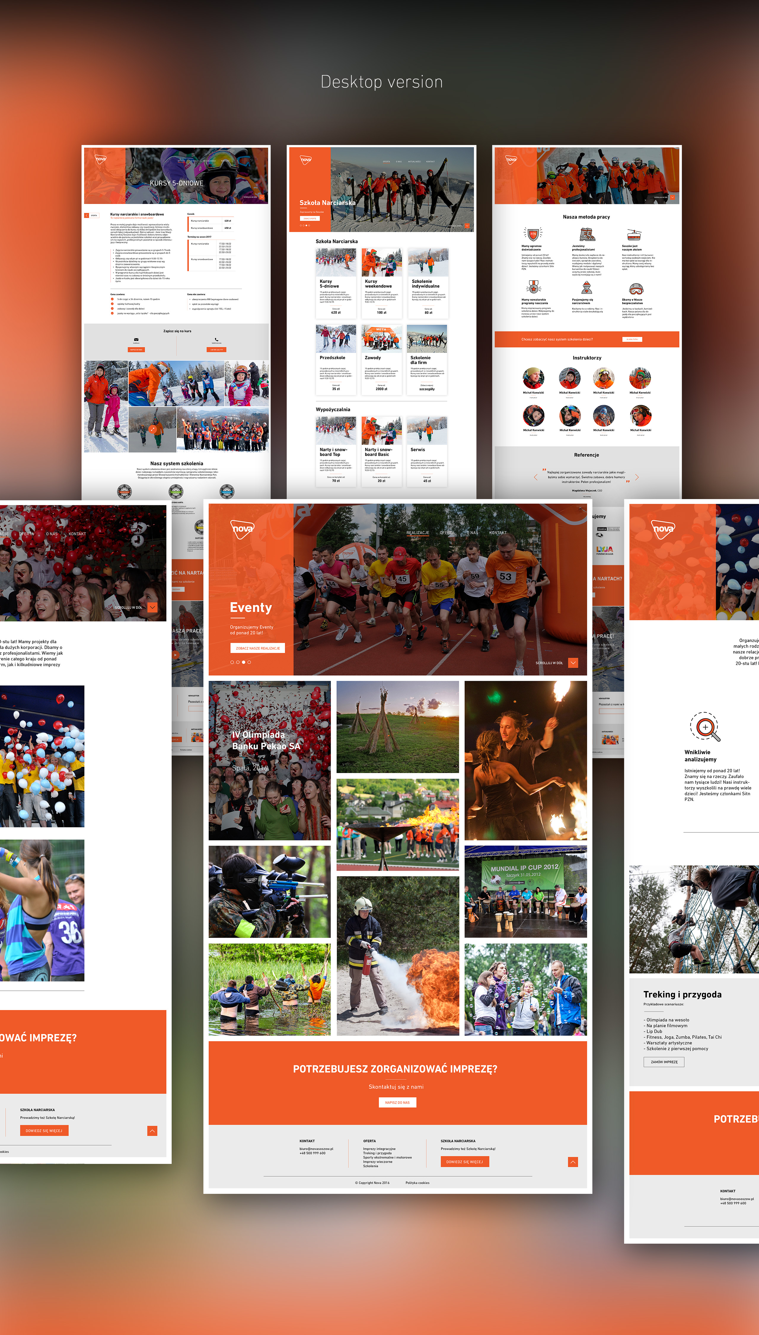
The Nova ski school, which functions at the same time as an event agency, was in need of a totally refreshed responsive website. Above all, the website needed to be easy to use in various circumstances: in the privacy of your home, on your way to a ski resort, and on the ski slope itself. The initial talks showed that the main communication channel concerning individual customers in the ski industry is the phone, whereas contacts with corporate clients usually take place by e-mail. One of the crucial goals of the project was to organize the offer of the ski school and the event agency, to characterize the methodology of work and services, and to enhance the position of the company as one unified organization. As a result of an in-depth analysis, I concluded that the main target group of the company were individual customers, purchasing the services of the ski school and ski rental. Services related to the corporate clients turned out to be secondary: organization of competitions, trainings, trips, and team-building events, which complete the winter services throughout the year. Therefore, I had to include and combine the two offer types in the project.
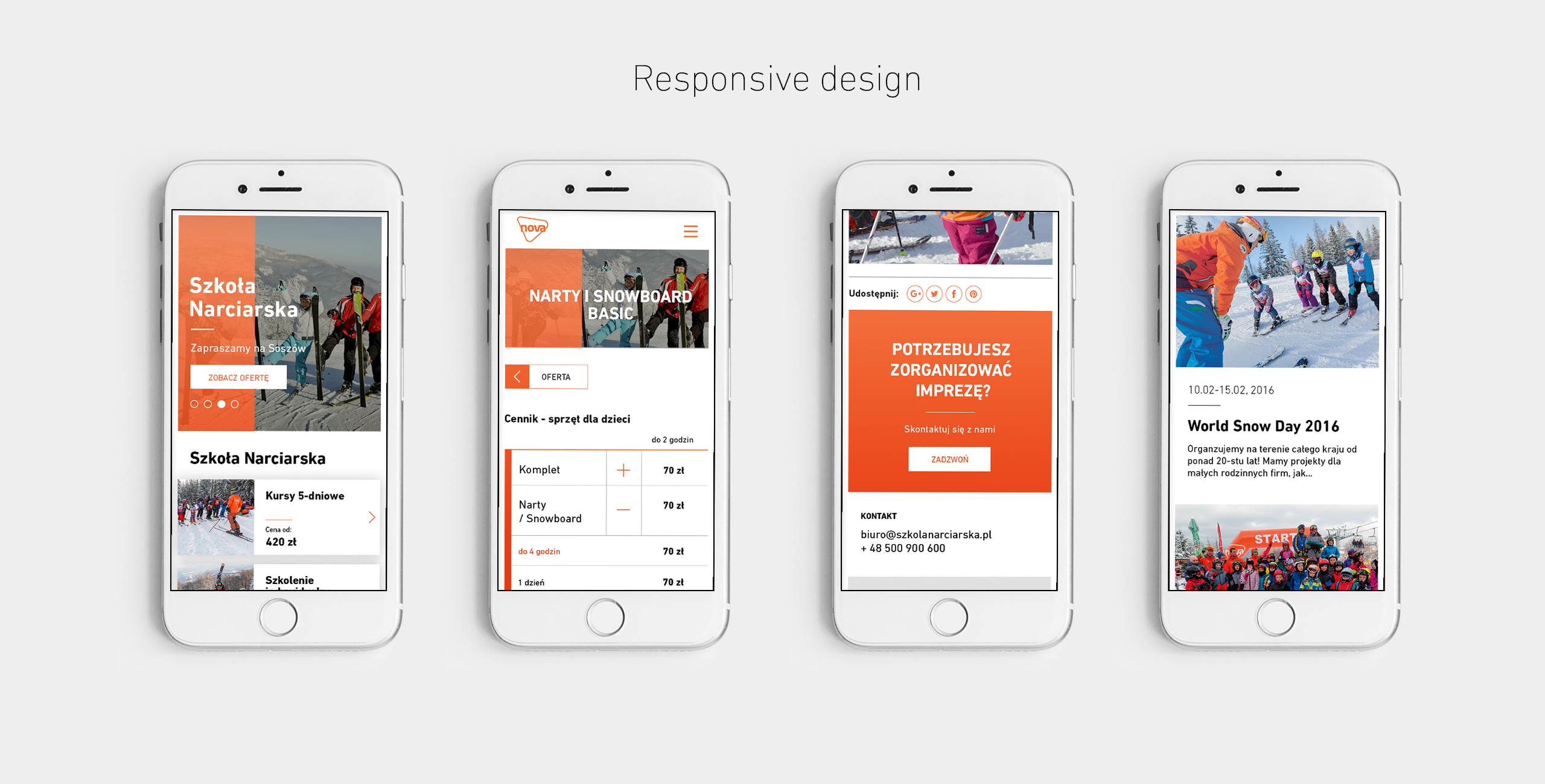
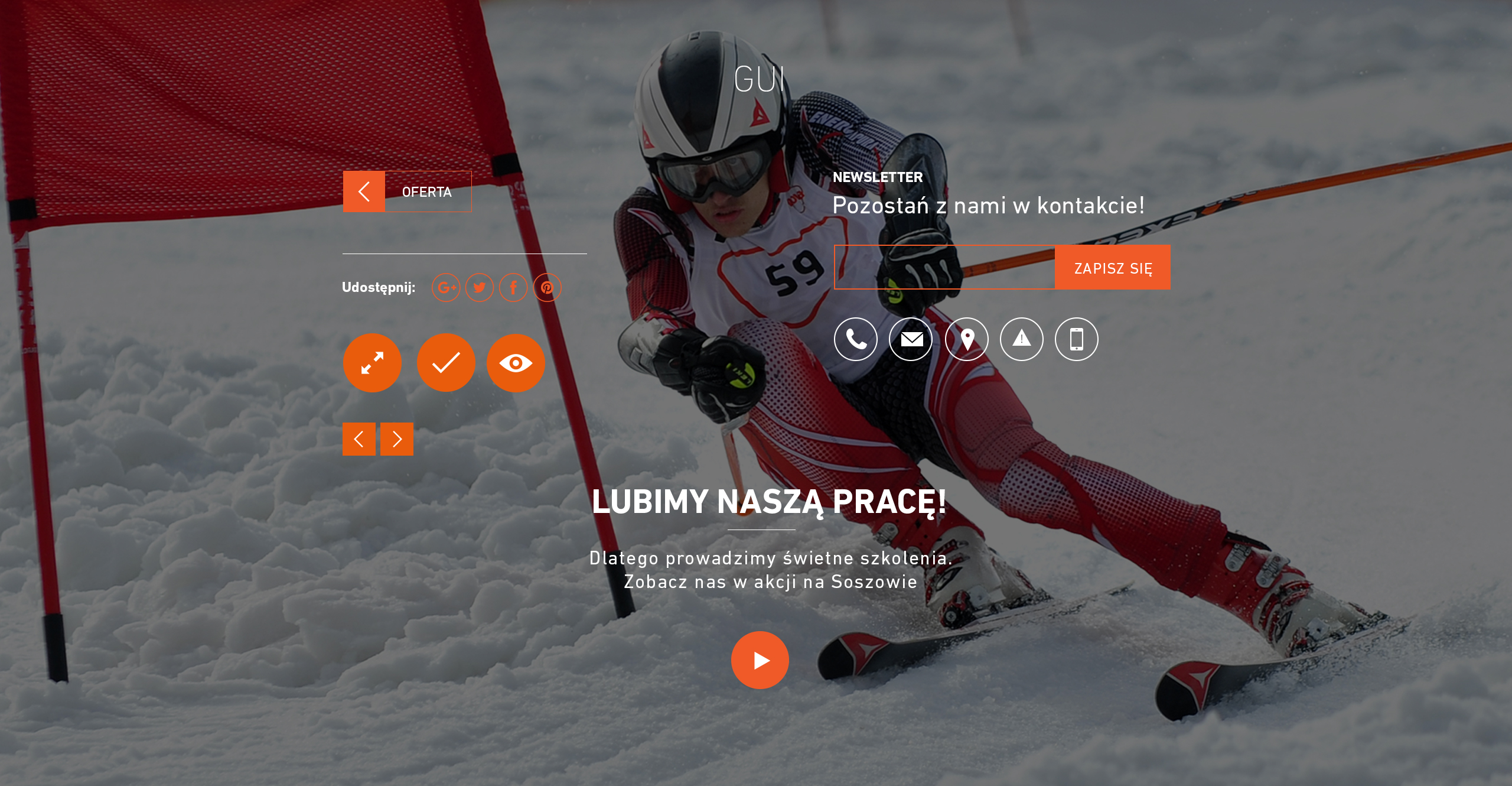
I designed an easy-to-use and easy-to-read website, corresponding with the dynamic brand I had created for years. The design is based on a characteristic color scheme and big photos specially commissioned by the school. I succeeded in persuading the company to resign from stock photos and to make their offer more reliable thanks to a short video. I placed particular emphasis on the website’s responsiveness; the mobile and tablet versions are not one-to-one mappings of the desktop interface. I introduced special facilities in the offer and smart solutions in the price lists, which reduced the content in order to gain in usability and space without losing the core message. The leading channel of individual users’ communication with the school was set on the phone. Call-to-action elements lead them in a simple way to a phone call or to Skype or FaceTime. The business offer directs corporate clients to e-mail. The web layout design is accompanied by the uniform user interface and icons depicting the basic services offered by the company. This improved the legibility and clarity of the information. Unlike in the case of the previous website, the web developer and I decided to introduce a multisite solution, with two different domains for individual customers and corporate clients. That allowed us to adjust the two separate landing pages to the needs of each target group.
Web development: Progress